Thursday, 9 February 2012
My Colour Scheme - Analysis
For the photos I used in my magazine publication, I decided to feature my cover star with bright red lips, and a subtle light purple coloured jumper. I used red lips as a dramatic element which also accompanied my red cover lines well. As my target audience was a range of alternative music fans who potentially would like to stand out from the typical mainstream music listeners, I felt that by having a quirky character on the cover, my target audience would be able to relate better and would be attracted to buying my publication.
Evaluation
In what ways does your media product use, develop or challenge forms and conventions of real media products?
How did you attract/address your audience?
- My media product has one character on the cover with a plain white background. This complies with the ordinary conventions of many fashion/music magazines found today as they use the audience’s foreknowledge of that celebrity or famous personality to attract the reader’s attention.
- I have used plain black lettering for my masthead, which challenges the expected conventions of the expected magazine because often these words are made to stand out using bright colours and other effects to catch the reader’s eye. I decided to use plain black letters for my masthead because I thought the relaxed, understated style of text would suit my audience as I was aiming to appeal to a very alternative new kind of audience.
How does your media product represent particular social groups? - My media product represents middle class, alternative music fans.
- It represents them by having a simple layout and good quality photographs featured, making people more interested in design feel interested by the magazine.
What kind of media institution might distribute your media product and why? - A sort of media institution like Bauer Media would distribute my magazine because it covers a target audience that they have not already covered with the other music publications they distribute such as Kerrang! and Q.
-
Who would be the audience for your media product? - The target audience for my media product would be young people ranging from 16 – 24 years old.
- They would be middle class, and interested in alternative style music that differs from the mainstream genre that is widely put across using television and further advertising.
- These people may study Art, Music, Photography, Performing Arts, Literature, or other equally creative subjects as the magazine aims to attract people with an eye for design.
How did you attract/address your audience?
- I addressed my target audience with my magazine title “Defiance
- I used high quality photography, making the magazine look more expensive and more professional. The photography is important in a magazine of this style, because the artistic side of the publication is as important as the content to some people as that’s the target I’ve gone for.
What have you learnt about technologies from the process of constructing this product? - Camera – For creating my magazine I used a Canon a230 camera, to create high quality shots to make my publication look expensive and professional. These photos helped ensure the colours were vivid and eye catching.
- InDesign – I used InDesign to actually make my magazine and learnt a lot about using layers to alter my layout.
- Photoshop – I used Photoshop to make my background white, and to up the contrast further on my images to make them more vivid.
Looking back at your preliminary task, what do you feel you have learnt in the progression from it to the full product? - I feel I have learnt a lot about using Photoshop and InDesign during the process of making my magazine and I now know more about using layers specifically.
- I also think my images are of a better quality compared with in my preliminary task, as I used a better quality camera.
Double Page Spread - Why I chose my Image

Tuesday, 7 February 2012
Cover - Chosen Cover Image
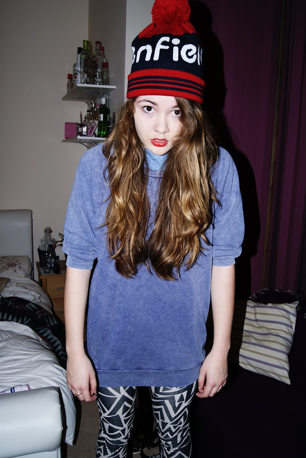
For my actual cover, I made the background white and had just her figure as the main feature of my cover.
Cover - Photo I Considered Using
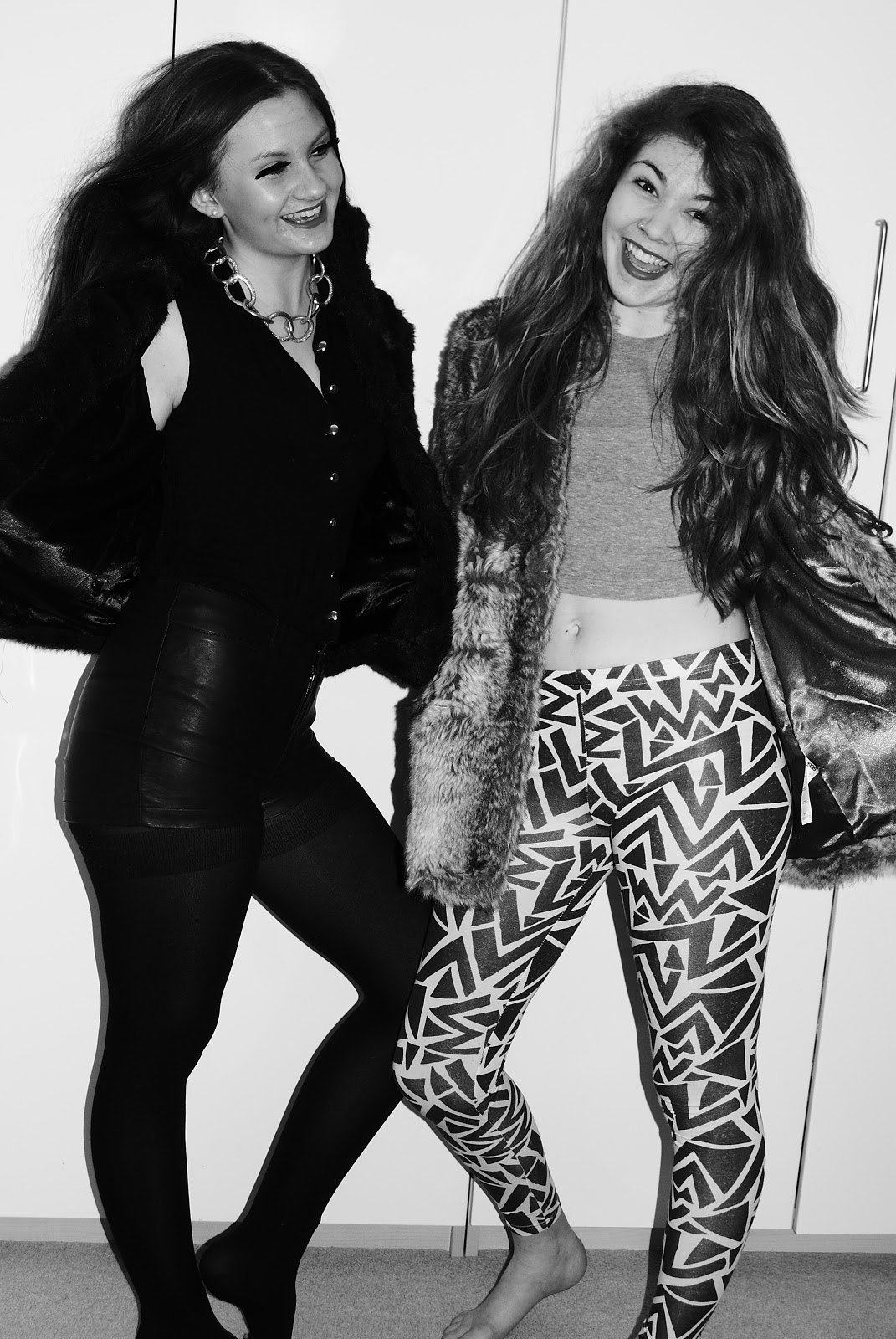
If I had used this photo on my cover, I would have cut out the two girls and had a completely white background.
Another thing that made the image less practical for my magazine cover was the fact that it was black and white, which wouldn't have helped my magazine to stand out amongst other publications.
Thursday, 2 February 2012
Cover Page - Cover line analysis
On the front cover of my magazine, I had trouble deciding whether to have exclamation marks or not, as they gave off the wrong feel for my magazine. With my cover star being of an edgy, cool style, having exclamation marks didn't match the target audience I was trying to appeal to. In the end I decided not to have them on most of the cover lines; apart from the red letters reading "FASHION SPECIAL!" as I found it important that these words stand out well.
Subscribe to:
Comments (Atom)