Tuesday, 7 February 2012

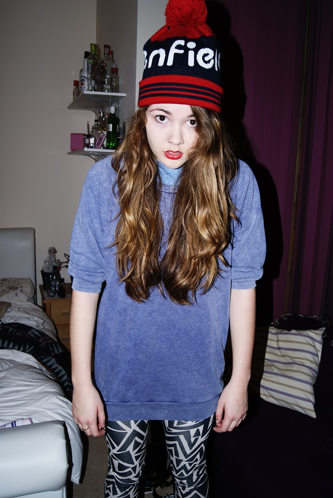
Cover - Chosen Cover Image

This is the image I chose to use on my magazine cover. I liked the way the red hat matched her red lips, and stood out amongst the otherwise fairly light colours. I also liked her facial expression as I thought it went well with the overall theme of my publication. Being called 'Defiance', I aimed to target a more alternative audience that perhaps would want to read a magazine that aimed to differ greatly from the mainstream music magazine that the majority would read.
For my actual cover, I made the background white and had just her figure as the main feature of my cover.
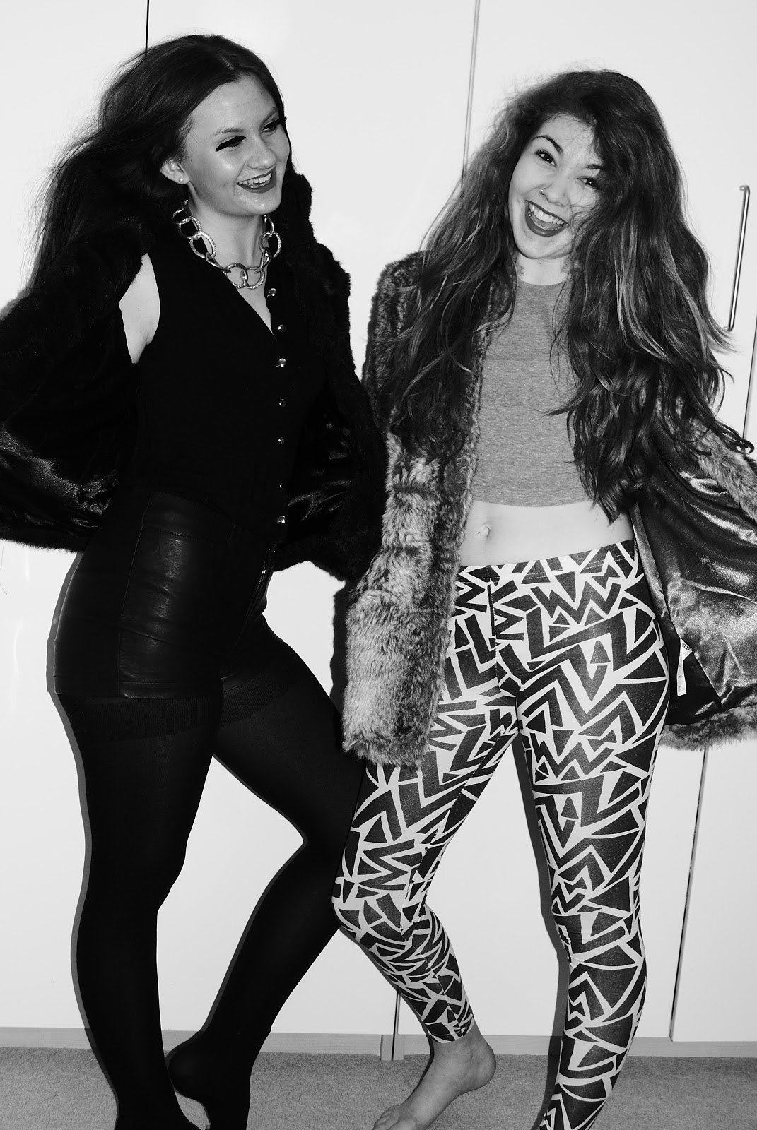
Cover - Photo I Considered Using

Initially I was going to use this image on the front cover of my magazine, but I changed my mind because the magazines I'd researched beforehand had mainly featured one person on the cover, and had mostly expressionless faces. 
If I had used this photo on my cover, I would have cut out the two girls and had a completely white background. 
Another thing that made the image less practical for my magazine cover was the fact that it was black and white, which wouldn't have helped my magazine to stand out amongst other publications. 

Thursday, 2 February 2012

Cover Page - Cover line analysis

On the front cover of my magazine, I had trouble deciding whether to have exclamation marks or not, as they gave off the wrong feel for my magazine. With my cover star being of an edgy, cool style, having exclamation marks didn't match the target audience I was trying to appeal to. In the end I decided not to have them on most of the cover lines; apart from the red letters reading "FASHION SPECIAL!" as I found it important that these words stand out well. 

Monday, 23 January 2012

i-D Magazine - Image Series Analysis

Here are some examples of images taken of an artist in i-D magazine. 
Next to these images, a quote from the artist is shown: "I like my music to be as bright as my clothes.", giving the reader an insight into the artist's personality and also making a link between her fashion and music style which is something I need to focus on as I'm doing a 'Fashion Special' of a music magazine. 
I think the bright yellow wall in the background really helps the image to stand out, and again relates to the artist's fierce personality. I may experiment with this idea for my own magazine images. 

i-D Magazine Cover Analysis

Here is an example of the front cover of i-D magazine. This cover in particular is very simple with only one main close up image of the artist (Leona Lewis') face. It uses a very neutral colour palette and no bright colours are used to stand out. 
I like this cover because the image is used as the focal point and main focus of the cover. I may experiment with using a similar style in my own work. 
There are very few cover lines on this publication further emphasising the photograph and making it the main focus. The masthead is written vertically on this cover, which I think is a good design feature and makes this magazine differ to many others that target a similar audience. 

Monday, 16 January 2012

Typical Magazine Conventions

Here are some of the basic conventions of a magazine. Here the main image is layered over the masthead suggesting to the reader that this is a well known magazine that doesn't need to worry about it's audience not recognising the cover. It uses bright pink and lime green colours over the otherwise fairly monotone image to stand out and catch the audience's eye.

Sunday, 8 January 2012

Contents Page - Planning and Research


Here is an example of a contents page with lots of smaller images around the edge, with page numbers next to them indicating which page that article is on. Here is an example of Vogue magazine's contents page, and I like the use of one image placed next to the columns of text. I also like the large title across the top of the page, and the pink bold letters used for the subheadings.