Friday, 9 March 2012
Thursday, 8 March 2012
Final Double Page Spread

Final Contents Page

I added professional touches such as a website name at the bottom of the page, and the editor's signature in a different "hand-writing style" font.
Final Cover

I used the colour red to make the cover more eye catching and I used a photograph that was suitable in attracting my target audience of alternative, young, middle class people interested in subjects such as photography, performing arts, creative design and technology.
Thursday, 9 February 2012
My Colour Scheme - Analysis
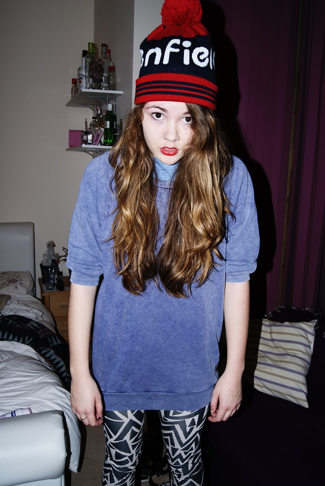
For the photos I used in my magazine publication, I decided to feature my cover star with bright red lips, and a subtle light purple coloured jumper. I used red lips as a dramatic element which also accompanied my red cover lines well. As my target audience was a range of alternative music fans who potentially would like to stand out from the typical mainstream music listeners, I felt that by having a quirky character on the cover, my target audience would be able to relate better and would be attracted to buying my publication.
Evaluation
In what ways does your media product use, develop or challenge forms and conventions of real media products?
How did you attract/address your audience?
- My media product has one character on the cover with a plain white background. This complies with the ordinary conventions of many fashion/music magazines found today as they use the audience’s foreknowledge of that celebrity or famous personality to attract the reader’s attention.
- I have used plain black lettering for my masthead, which challenges the expected conventions of the expected magazine because often these words are made to stand out using bright colours and other effects to catch the reader’s eye. I decided to use plain black letters for my masthead because I thought the relaxed, understated style of text would suit my audience as I was aiming to appeal to a very alternative new kind of audience.
How does your media product represent particular social groups? - My media product represents middle class, alternative music fans.
- It represents them by having a simple layout and good quality photographs featured, making people more interested in design feel interested by the magazine.
What kind of media institution might distribute your media product and why? - A sort of media institution like Bauer Media would distribute my magazine because it covers a target audience that they have not already covered with the other music publications they distribute such as Kerrang! and Q.
-
Who would be the audience for your media product? - The target audience for my media product would be young people ranging from 16 – 24 years old.
- They would be middle class, and interested in alternative style music that differs from the mainstream genre that is widely put across using television and further advertising.
- These people may study Art, Music, Photography, Performing Arts, Literature, or other equally creative subjects as the magazine aims to attract people with an eye for design.
How did you attract/address your audience?
- I addressed my target audience with my magazine title “Defiance
- I used high quality photography, making the magazine look more expensive and more professional. The photography is important in a magazine of this style, because the artistic side of the publication is as important as the content to some people as that’s the target I’ve gone for.
What have you learnt about technologies from the process of constructing this product? - Camera – For creating my magazine I used a Canon a230 camera, to create high quality shots to make my publication look expensive and professional. These photos helped ensure the colours were vivid and eye catching.
- InDesign – I used InDesign to actually make my magazine and learnt a lot about using layers to alter my layout.
- Photoshop – I used Photoshop to make my background white, and to up the contrast further on my images to make them more vivid.
Looking back at your preliminary task, what do you feel you have learnt in the progression from it to the full product? - I feel I have learnt a lot about using Photoshop and InDesign during the process of making my magazine and I now know more about using layers specifically.
- I also think my images are of a better quality compared with in my preliminary task, as I used a better quality camera.
Double Page Spread - Why I chose my Image

Tuesday, 7 February 2012
Cover - Chosen Cover Image
For my actual cover, I made the background white and had just her figure as the main feature of my cover.
Cover - Photo I Considered Using
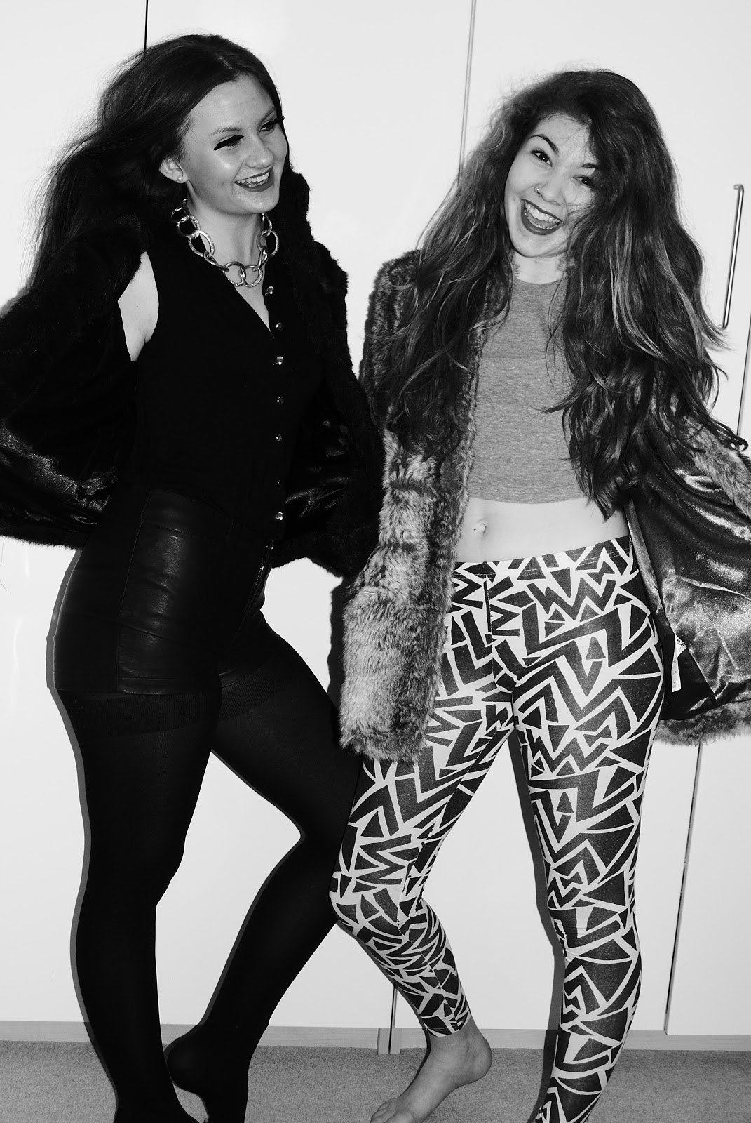
If I had used this photo on my cover, I would have cut out the two girls and had a completely white background.
Another thing that made the image less practical for my magazine cover was the fact that it was black and white, which wouldn't have helped my magazine to stand out amongst other publications.
Thursday, 2 February 2012
Cover Page - Cover line analysis
On the front cover of my magazine, I had trouble deciding whether to have exclamation marks or not, as they gave off the wrong feel for my magazine. With my cover star being of an edgy, cool style, having exclamation marks didn't match the target audience I was trying to appeal to. In the end I decided not to have them on most of the cover lines; apart from the red letters reading "FASHION SPECIAL!" as I found it important that these words stand out well.
Monday, 23 January 2012
i-D Magazine - Image Series Analysis

Next to these images, a quote from the artist is shown: "I like my music to be as bright as my clothes.", giving the reader an insight into the artist's personality and also making a link between her fashion and music style which is something I need to focus on as I'm doing a 'Fashion Special' of a music magazine.
I think the bright yellow wall in the background really helps the image to stand out, and again relates to the artist's fierce personality. I may experiment with this idea for my own magazine images.
i-D Magazine Cover Analysis

I like this cover because the image is used as the focal point and main focus of the cover. I may experiment with using a similar style in my own work.
There are very few cover lines on this publication further emphasising the photograph and making it the main focus. The masthead is written vertically on this cover, which I think is a good design feature and makes this magazine differ to many others that target a similar audience.
Monday, 16 January 2012
Typical Magazine Conventions

Here are some of the basic conventions of a magazine. Here the main image is layered over the masthead suggesting to the reader that this is a well known magazine that doesn't need to worry about it's audience not recognising the cover. It uses bright pink and lime green colours over the otherwise fairly monotone image to stand out and catch the audience's eye.
Sunday, 8 January 2012
Contents Page - Planning and Research

Here is an example of a contents page with lots of smaller images around the edge, with page numbers next to them indicating which page that article is on.
 Here is an example of Vogue magazine's contents page, and I like the use of one image placed next to the columns of text. I also like the large title across the top of the page, and the pink bold letters used for the subheadings.
Cover Ideas & Research


For my magazine I plan to have a plain background with a large image of my artist (that my double page spread is aboout) being the main focus. I'd like to have my masthead in either black layered behind my image, or a bright colour that matches an element of my photograph. For example, bright red title and bright red lipstick.
Here is an example of a vogue magazine cover that uses a similar idea. The red of the model's lips tie in with the red on the masthead.
Again in the image below, colours in the model's clothing and the writing are the same shades of pink.


Wednesday, 4 January 2012
Double Page Spread Article - Planning
I'm plan to include an article on my double page spread surrounding my image laid on a white background. I'm going to have the questions in bold and the artist's answers in normal font to make it clear to the reader which is which.
Hey (insert artist's name here)! Thank you so much for agreeing to meet with us!
Oh, you're so welcome! I'm still trying to get my head round the fact that people actually want to ask me questions! It's mad! (Laughs)
So, tell us what inspired you for your new album?
It was a mixture of happy times from my childhood and trying to express what direction I want to go with my future. My easiest way to express that was through music, and it always has been ever since I was tiny.
If you only had a chance to introduce someone to one song from the album, which song would it be?
It would definitely be "Never Forever" because the message behind the song is made really clear through the lyrics. It's about how no bad feeling ever lasts forever and how everything can always get better if people give themselves time and actually decide to let things improve.
What artists are you listening to at the moment?
I'm obsessed with Nicki Minaj! I also love Beyonce, Jessie J, and Ms Dynamite.
Who would you love to perform with?
Beyonce would obviously be a dream come true, but I'd also love to work with some male rappers this year. I'm looking to branch out and attract a wider audience to help me grow as an artist. I'm keeping my fingers crossed that the phone call will come through any day now...
What's your favourite high street shop?
I adore Topshop! I really like the key pieces they sell and every time I'm in London I make my manager set aside at least a day for me to spend in there! (Laughs) I also love Urban Outfitters and especially American Apparel because they sell such outrageous clothes that are perfect for raves and festivals if you want to stand out! The hotpants are a particular favourite of mine!
Who are your style icons?
Jessie J is a big style icon for me, as she goes against the crowd and mixes lots of key style pieces in the same outfit. I have also have a lot of respect for women who manage to look stylish, classy and sexy all at the same time. For example Kelly Rowland.
Do you have a favourite designer?
ALEXANDER MCQUEEN! Long live McQueen. My favourite piece is a coat I bought about a year ago, I never leave the country without it!
We like her style. Order her Album now on iTunes.
Tuesday, 3 January 2012
My Double Page Spread - Planning

I plan to feature an urban sort of artist photographed a similar way to Rihanna or Jessie J.

Here I like the way the artist is placed on a white background, and I plan to also do this with my image layout. I'll use features of the styling of the artist to make them stand out in a similar style to this, for example bright red/pink lips or bright clothing/jewellery.
Further Double Page Spread Research

Looking more closely at design styles of double page spreads has given me some further ideas to ways in which I could lay out my text. Here, the interview with Nicki Minaj has been laid out in a more abstract way with the writing surrounding the picture instead of just being placed next to it.
In particular the way the writing curves around next to her neck is a clever way of using layout, and I'll take inspiration from this in my own work. In a similar way to the photo of Florence with bright red hair relating to the red of the material in the photo, the pink background of these pages, the darker shade of pink for the artist's name and her pink lipstick all tie in together and draw the reader's attention.
Double Page Spread Research

The colour scheme used is clever because red ties in with the theme "USA" written in faded grey letters behind the image of Florence, as the audience's foreknowledge allows them to understand that red is in in the American Flag. The image is also cleverly used, because the bright red colour links to one of the things the artist is best known for; her bright red hair. I think I will use a similar style in my image, and have certain colour elements that relate to the text. For example; a pink item of clothing, with pink writing for the questions in bold.
 The content of the article includes a long introduction about the singer herself, followed by some interview style questions about what she is planning on doing with her careers in the following months. This is a similar style to what I will do with my own artist, and will begin by giving a brief background before asking about future plans.
Here is another example of a magazine double page spread, this article featuring Ellie Goulding. This style of DPS is different to the previous because the picture and text are kept separate. I prefer the other style as I think it makes the magazine look more professional. However the title still overlaps both pages making it clear it is in fact a double page spread. I like the style of photograph, because it's done the same way as the photo of Florence, with a white backdrop and little props cluttering up the image. I think I will take inspiration from both of these when taking the photographs for my own double page spread. The layout for this one is more basic, and doesn't make any design conventions or techniques obvious to the reader. This layout would maybe not be as appropriate to my target because design features may need to meet the high standards of people looking for more alternative music.
Possible Titles for my Music Magazine
- Defiance (Defiance Magazine)
- These Beats
- Listen
- Tuning Magazine
Existing Magazine Titles - Analysis
- Billboard Magazine -
- Q Magazine -
- Kerrang! -
BLOGGING – (PLANNING)
Print
Examples: General & Specific to genre
 I have taken a look at Company magazine as another example of print because I like the way they use a specific theme throughout the magazine using a certain font, and I like the layout of the images and text. I’m going to take inspiration from this for my own print. (have photo of company magazine in blog)
The music magazine I plan on basing my print product on is Billboard magazine because I think it covers a wide range of music genres and could appeal to a wider audience than some other rock magazines for example.
Covers: Star, text (size, font, colour), layout, title, schemes

 Billboard magazine has had many urban artists on the cover in the past, such as Nicki Minaj, Drake and Beyoncé. On my cover I will have a photo of one person and edit the image by increasing the level of contrast and brightness to make the image more dramatic. I’m going to use pink as my main colour to attract my audience’s attention as my target audience is women aged 18-25 who are interested in urban music. The background behind my image will be plain white, as shown on most Company magazine covers, and I may have to manipulate my image to create the white background. I’m going base my cover’s colour scheme on Company magazine by having the colour of the text match an element of what my cover star is wearing.
Subscribe to:
Comments (Atom)